- Vibe Marketing Club
- Posts
- Nike doesn't sell products.
Nike doesn't sell products.
They sell something much stronger...

Hey fellow vibe marketer, welcome back to the Vibe Marketing Club.
Thought: If you want to get people to buy, market to who they want to become. Identity is one of the strongest factors you can point to if you want loyal, repeat purchase customers. Ex: Nike doesn’t sell clothing and shoes, they sell winning and giving it your all in competition.
With that being said, there are times to sell identities and times to sell value props. Fun fact, Atria has a full, comprehensive analytics system where we scrape your top performing angles to use for this exact reason. You can check it out here!
On to this week’s AI ads, why they work, and how you can apply them to your brand.
Ads sourced with inspiration from the most powerful AI ad tool and extensive ad library.
Ads of the Week
Mott & Bow, Mount to Coast, Sett
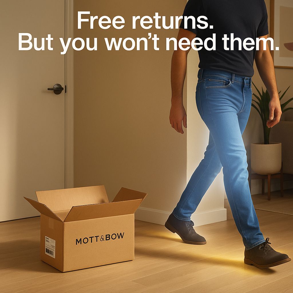
Mott & Bow
Analysis:
Confidence kills, and this ad is as confident as the day is long. Why it works? Because if you’re products can be backed by your reputation, you’ll convert people (one thing I’d add to this ad is a strong review + avg return rate metrics). By saying “Free returns,” the brand removes the fear of making a bad decision (loss aversion). But the headline, “But you won’t need them,” instantly reframes the offer as a vote of confidence, which reduces uncertainty, hesitation, and increases trust.
How you can apply it:
Eliminate risk up front.
Immediately follow with a confidence statement like “But you won’t need it” or “You’ll want two.”
Use visual proof of satisfaction (Glowing product, happy customer, or unopened return box = confidence).
Appeal to the ego.
Turn objections into hooks. Instead of avoiding friction, address it and frame it as reassurance.
Prompt:
Create a hyper-realistic, editorial-style image in a 1:1 aspect ratio. The scene takes place in a softly lit, modern apartment entryway with neutral tones and minimal decor. On the left side, show a cardboard shipping box labeled with a realistic Mott & Bow return label—flaps open, but clearly untouched, as if the jeans were never considered for return. The box sits on the floor near the door with soft shadows and a slight natural glow around it. On the right side, show a person walking confidently mid-stride, wearing glowing, perfectly-fitted Mott & Bow jeans. Their posture is strong, stride relaxed, and the jeans subtly emit a soft glow that suggests premium quality and unmatched fit. The person's upper half is only partially visible to keep focus on the jeans and motion, not the face. Overlay the headline at the top center in clean, bold Helvetica font: “Free returns. But you won’t need them.” The lighting should feel natural and aspirational, evoking satisfaction, confidence, and that post-try-on “hell yes” feeling. The tone is modern, elevated, and grounded in trust—built to reassure new buyers while reinforcing product quality.
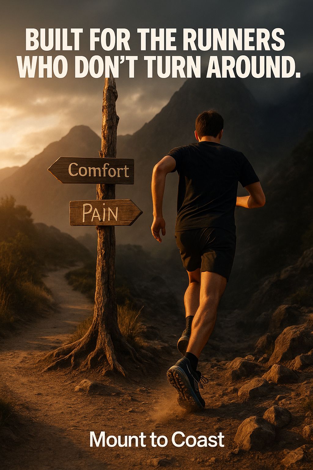
Mount to Coast
Analysis:
“This is for people who like to push themselves,” is essentially what this ad is saying. It’s identity marketing and ingroup/outgroup bias to appeal to “that kinda person”. By contrasting “Comfort” and “Pain,” the brand draws a line in the sand: Are you the type to turn back, or push forward? The headline, “Built for the runners who don’t turn around,” is both a challenge and a compliment to activate the self-perception theory (“That’s me”) and reinforce their identity as disciplined, gritty, and elite. Mount to Coast is a brand for those who embrace the suck. It’s less about the product and more about who you are when you wear it.
How you can apply it:
Draw a line in the sand. Position your product as a tool for a specific type of person (“for the ones who ___”).
Use contrast to spark identity. Visually or verbally present two opposing choices (e.g., Comfort vs Pain) and clearly favor one.
Use self-perception. Let your audience self-identify with strength, discipline, or uniqueness.
Make your customer the hero, frame the purchase as part of their journey to become who they aspire to be or who they are.
Design for aspiration, not just utility. Sell the mindset, the values, and the mission, not just the product.
Prompt:
Create a hyper-realistic, editorial-style image in a 9:16 aspect ratio. The scene is set outdoors in a dramatic mountain trail environment during golden hour, with low, directional sunlight casting long shadows and a warm glow across the landscape. At the center of the composition is a fork in the trail, marked by two wooden trail signs nailed to a split tree. One sign points left and reads “Comfort” in clean, smooth lettering; the other points right and reads “Pain” in rougher, hand-scratched font. The right trail (Pain) should look rugged—rocky, uphill, and partially obscured by fog or shadow—while the left (Comfort) is flat, smooth, and sunlit with the arrow facing away from where the runner is headed. A lone runner, mid-stride, is captured from behind, just as they choose the “Pain” path with the arrow pointing toward the way they are running. Their body language should convey purpose and determination, with their Mount to Coast shoes clearly visible and catching a subtle glow or light reflection. Dust may be kicking up slightly from the step, adding motion realism. Overlay the headline at the top center in bold, clean Helvetica Bold: “Built for the runners who don’t turn around.” The image should feel cinematic, grounded, and emotionally resonant—suggesting choice, grit, and defiance. This isn’t just a trail scene—it’s a metaphor for what it means to be a Mount to Coast runner: the kind of person who keeps going, no matter what’s ahead.
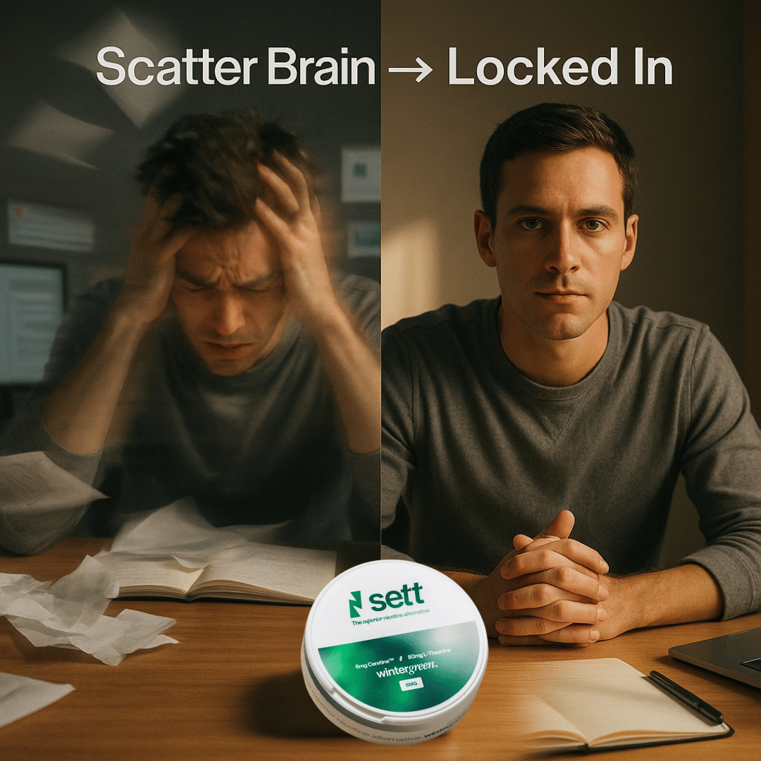
Sett
Analysis:
This is a before-and-after framing and contrast principle ad, visually dramatizing the shift from chaos (before Sett) to clarity (after Sett). The copy “Scatter Brain → Locked In” provides a clear and instant transformation. One side overwhelms the viewer with blur and motion to stimulate overwhelm and stress, while the other calms you with focus and stillness. Centering the Sett tin at the bottom visually anchors the change and positions it as the cause.
How you can apply it:
Use a clear before/after contrast.
Make the benefit feel immediate.
Anchor your product visually by placing it between the “before” and “after” to symbolize causation.
Appeal to emotional states, show a pain point your customer actually feels, and the relief they desire.
Keep it clean and digestible. One core idea, one core visual transformation, zero clutter and confusion.
Prompt:
Create a hyper-realistic, editorial-style image in a 1:1 aspect ratio. The visual is split into two contrasting frames or blended exposures to suggest transformation. On the left side, show a young professional male at a cluttered desk, visibly overwhelmed. Use multiple-exposure blur to create a chaotic, scatterbrained effect—hands on head, paper flying, notifications popping up on a screen, poor posture, dim lighting. On the right side, the same man is shown in sharp focus, seated at the same desk—but now with a clean, minimal workspace, upright posture, relaxed face, and intense focus. Light is warmer and directional, casting a productive mood. In the center foreground, resting neatly on the desk between the two states, is a Sett pouch tin—sharp, clean, and subtly glowing or catching light to draw attention. Overlay the headline at the top in bold Helvetica: “Scatter Brain → Locked In.” The image should feel cinematic and relatable, visually capturing the transformation from chaos to clarity with Sett as the catalyst.
Annnnnndddd that’s a wrap for this week. Hope you enjoyed. Be sure to let us know how we did with the poll below!
As always, keep the good vibes rollin’ and we’ll see you next week.
Oh and if you want to ship winning ads 10x faster, get AI recommendations, and premade one-click analytics reports, bounce over here!
P.S. When you decide to book a demo with our team, let them know if this newsletter was the reason you booked. It’ll help me keep my job and have super secret vibe sessions while drinking my morning coffee.
Did you vibe with this week's newsletter?We need to know if we're chill. |