- Vibe Marketing Club
- Posts
- Should you attack your competition?
Should you attack your competition?
There's a fine line...

Hey vibe marketer, welcome back to the Vibe Marketing Club.
Thought: Bashing your competition is a one-way ticket to diluting your brand. Subtle, playful jabs are okay. Ads that highlight your differences, such as 'Us vs. Them' ads, are acceptable, but avoid criticizing your competitors.
Better yet, call out the industry standard, like one of the ads below. And if you want to leave your competitors behind completely, you can try Atria’s competitor spying tool by clicking here to book a demo, or by watching the video below!
Now, let’s dive into this week’s AI ads.
Ads sourced with inspiration from the most powerful AI ad tool and extensive ad library.
Ads of the Week
The Black Stuff, Oliver Cabell, Javvy Coffee
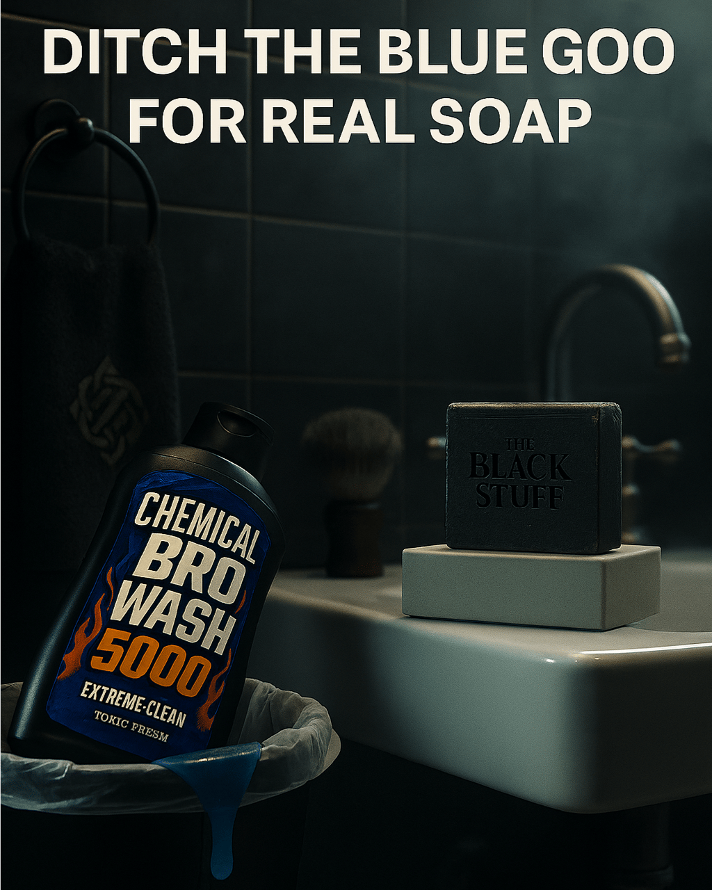
The Black Stuff
Analysis:
Like I said above, calling out an industry standard is one of the best ways to position yourself because it uses Contrast bias and morally reframes your way of business. The visual rejection of “Chemical Bro Wash 5000” in favor of “The Black Stuff.” The dramatic lighting, gross blue goop, and over-the-top name exaggerate the artificial, juvenile nature of typical body washes, making them feel cheap and toxic. In contrast, the minimalist, stoic design of the soap signals authenticity, quality, and maturity. The line “Ditch the blue goo for real soap” uses humor and simplicity to deliver a clear call to identity: grown men don’t use neon goop made with chemicals.
How you can apply it:
Use visual contrast to make other products inferior.
Mock the status quo and exaggerate what’s “normal” (like childish soap) to create tension and make your product feel like the adult upgrade.
Name the enemy by giving the competitor a ridiculous name (“Chemical Bro Wash 5000”), making it easier for your audience to emotionally “break up” with it.
Reframe quality as a lifestyle choice: “Real soap” isn’t just cleaner, it’s smarter, stronger, and more self-respecting.
Let your packaging visually support your brand’s values.
Prompt:
Create a hyper-realistic bathroom scene. In the foreground, place a plastic, absurdly over-designed men’s body wash bottle labeled “Chemical Bro Wash 5000” — think neon blue liquid inside, sharp fonts, flames or lightning bolt graphics, and buzzwords like “EXTREME CLEAN” and “TOXIC FRESH.” Headline reads: “Ditch the Blue Goop for Real Soap.” The bottle should be lying in a bathroom trash bin, slightly leaking neon blue goop. In contrast, elevate a sleek, handcrafted bar of The Black Stuff soap on a minimalist pedestal on the bathroom sink. The soap should look artisanal, matte black or earthy in tone, with soft lighting highlighting its texture. Make the space clean, moody, and masculine—dark tiles, metal fixtures, maybe a shaving brush nearby. Add steam or fog to suggest a post-shower glow. The tone should feel premium, grounded, and like a quiet revolt against synthetic junk. Include subtle Irish nods (like a Celtic knot on the towel or green tile accent).
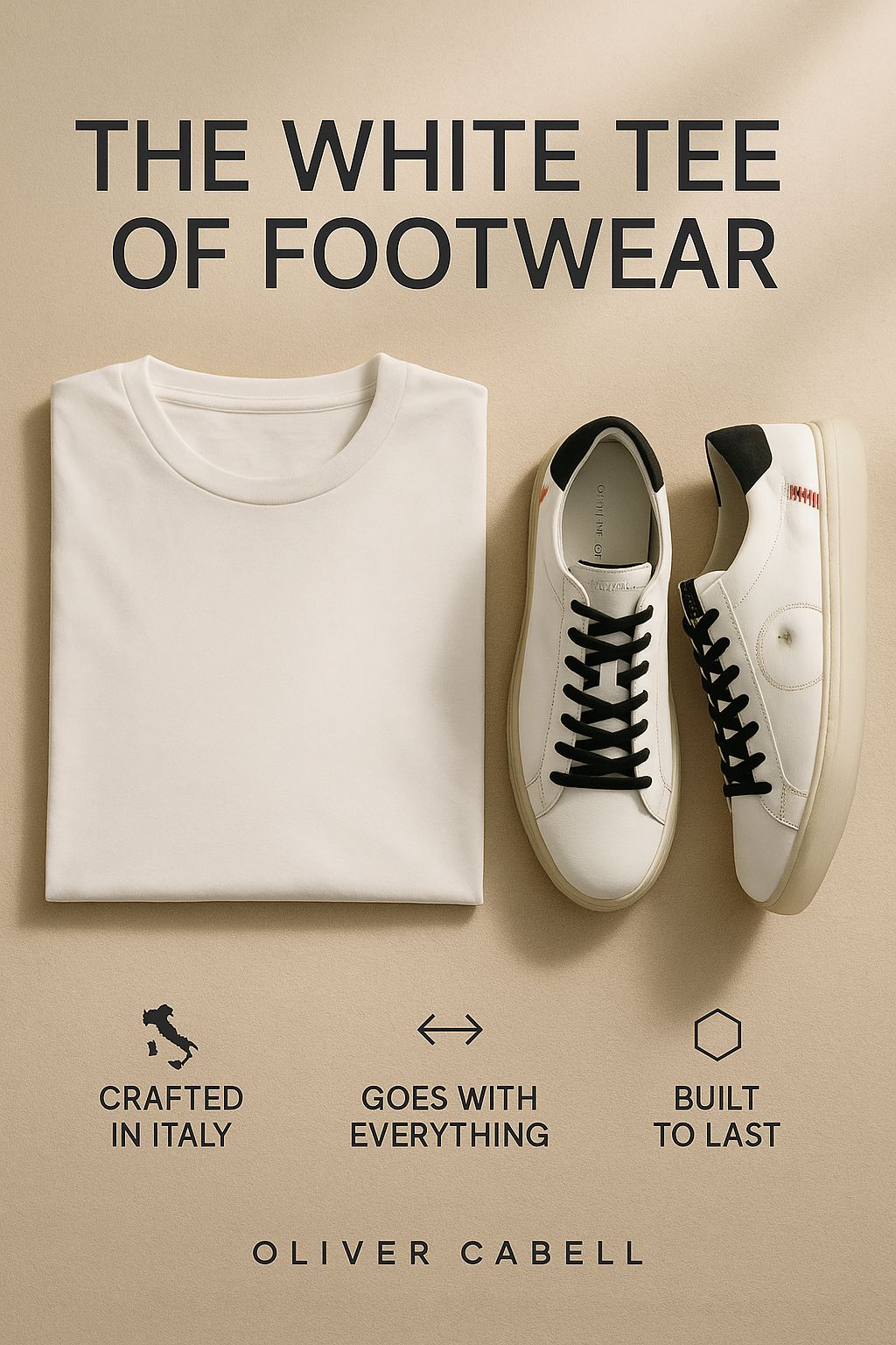
Oliver Cabell
Analysis:
This Oliver Cabell ad uses the categorization principle (a psychological shortcut where people quickly assign meaning by placing things into familiar buckets). Calling the sneakers “The White Tee of Footwear” instantly cues the viewer to think “versatile,” “timeless,” and “essential,” all without needing a wordy explanation. It reframes a potentially high-priced shoe as a must-have basic, leveraging the availability heuristic (everyone knows the white tee goes with anything) to increase mental accessibility and desirability.
How you can apply it:
Anchor to familiar items. Compare your product to a universal staple (e.g., "The Swiss Army Knife of skincare").
Use a metaphor as positioning.
Design with clarity & let your layout mirror what you're selling.
Hit category entry points to reinforce how and when the product is used (e.g., “goes with everything”).
Create premium minimalism by using a minimal layout.
Prompt:
Create a high-end, ultra-realistic fashion editorial-style scene. Center a crisp white t-shirt neatly folded or hung on a clean, neutral background—symbolizing timeless style. Next to it, showcase a pristine pair of Oliver Cabell Low 1 sneakers, positioned as the footwear equivalent of the white tee. The shoes must remain exactly as attached, you're not allowed to change a single aspect, they should look luxurious yet minimal, crafted from full-grain Italian leather with fine stitching and subtle texture visible. Include three benefits subtly integrated into the image as modern design labels or text: “Crafted in Italy”, “Goes With Everything”, and “Built to Last.” and they all should be evenly spaced at the bottom of the ad with congruent icons above each. The background should be soft, natural light with warm tones, evoking calm, premium simplicity. Use a top-down or 3/4 flat lay angle to keep the layout clean and scroll-stopping. The tone is refined, effortless, and aspirational—like every well-dressed creative’s dream wardrobe starter pack.
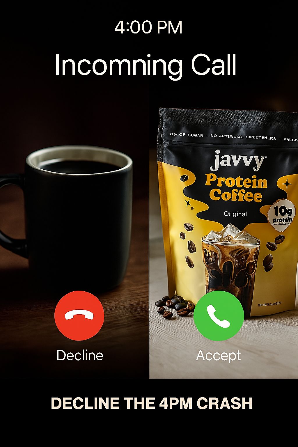
Javvy Coffee
Analysis:
The Zeigarnik effect is a powerful principle to hijack attention and simplify decision-making. By mimicking an iPhone call screen, the creative frames Javvy Protein Coffee as the “right call” in a familiar, interactive format (interface-jacking), forcing your into a mental decision: accept energy (protein + caffeine) or decline it (boring black coffee + crash). The kicker line “Decline the 4PM crash” adds clear pain-point relief and a temporal anchor (4 PM slump), increasing relevance and recall.
How you can apply it:
Mimic native interfaces to grab attention via pattern interruption.
Frame choices clearly, use side-by-side comparisons (old vs. new, boring vs. better) to guide people toward your product.
Anchor it to a moment, tie the solution to a specific, relatable time or event (e.g. “afternoon crash”) to build urgency.
Turn product into an action (“Accept”).
Design for interaction, not observation. Ask: “What would make someone pause and mentally engage?” Then build based on that.
Prompt:
Create an ultra-realistic digital ad with a modern iPhone incoming call screen layout as the base. The top should read “4:00 PM Incoming Call”, with the standard red Decline button on the left and green Accept button on the right at the bottom. The screen is split vertically down the center. On the left side, place a muted, dull image of a basic, lifeless cup of generic coffee—dimly lit, uninspired, and boring. On the right side, feature a vibrant, high-resolution image of Javy Coffee concentrate with its original packaging unchanged (use the exact attached visual, you're not allowed to change a single aspect of it), surrounded by cold brew ingredients like ice, milk, or a glass of coffee to make the scene feel energizing and refreshing. Use soft shadowing and natural light to make the Javy side pop, while the left side remains flat and drained. The Subheadline underneath the buttons reads “Decline the 4PM Crash”
Hope you got some value out of this week’s edition.
As always, thanks for vibin’ with me this week. While you’re here, check out Atria if you want to ship winning ads 10x faster, get AI recommendations, and premade one-click analytics reports, by bouncing over here!
P.S. When you decide to book a demo with our team, let them know if this newsletter was the reason you booked. It’ll help me keep my job and have super secret vibe sessions while drinking my morning coffee.
Did you vibe with this week's newsletter?We need to know if we're chill. |