- Vibe Marketing Club
- Posts
- You asked, we listened, & now it's here...
You asked, we listened, & now it's here...
Hope you enjoy!

Hey fellow vibe marketer, welcome back to the Vibe Marketing Club.
Quick PSA! We just rolled out a feature you've been asking for… guest invites!
Now you can bring clients, teammates, or external partners into your Atria workspace without adding extra seats. It’s perfect for agencies showing clients their ad performance, teams looping in consultants, or just sharing dashboards with stakeholders who don't need full access.
Here's what they'll be able to see:


Here's how to invite a guest:
Click “Invite people” in the left panel or workspace menu
Pick “Guest” as their role
Select the ad accounts you'd like them to see
Hit Send invite — they’ll get an email so they can jump right in
* Quick heads up: Guest access lives on Business and Enterprise plans.
You can give Guest Access a go here!
Now, on to this week’s AI ads!
Ads sourced with inspiration from the most powerful AI ad tool and extensive ad library.
Ads of the Week
Gruns, ARMA, Glossier
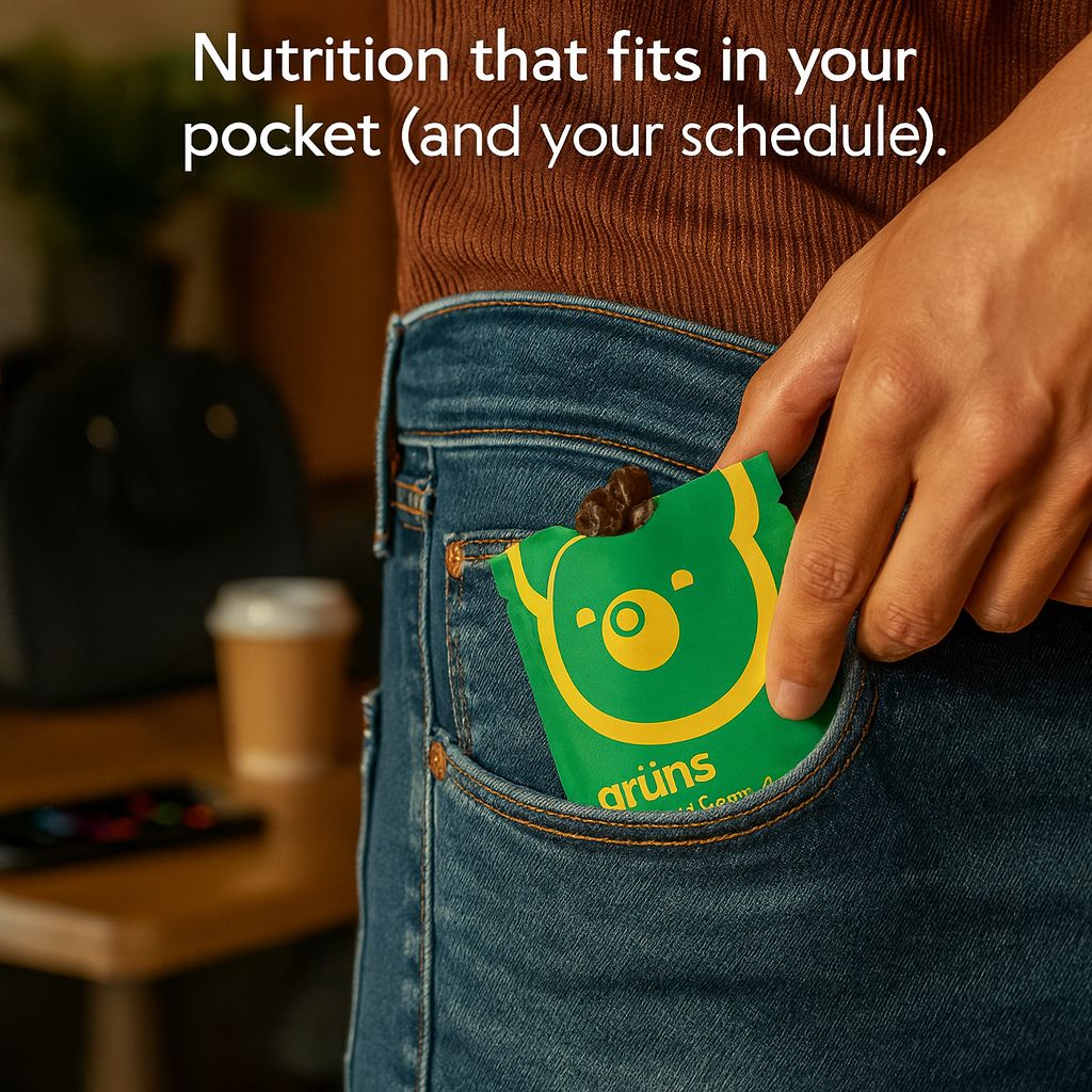
Gruns
Analysis:
This ad for Grüns is built on the principle of cognitive ease + convenience framing. The copy “Nutrition that fits in your pocket (and your schedule)” reduces friction by positioning the product as an easy and simple part of your daily life, with no prep, no hassle, and leaves you no excuses. The psychological win that people feel is making healthy “eating” and covering your nutritional bases feel as simple as carrying gum. By combining visual metaphor (pocket = convenience) with identity framing (busy people who care about health but not at the cost of time), it removes objections and makes Gruns the go-to choice for on-the-go nutrition.
How you can apply it:
Give the shortcut and show how your product saves time or simplifies life.
Use dual-framing copy to tie physical convenience to emotional convenience (“pocket + schedule”).
Leverage metaphors (e.g., pocket = portable).
Reduce objections visually by showing the product in action, solving the friction (instead of describing it).
Appeal to people’s identity by framing the product as a tool for people who see themselves as busy, efficient, and health-conscious.
Prompt:
Create an ultra-realistic, cinematic product ad with the headline: “Nutrition that fits in your pocket (and your schedule).” In the center of the frame, showcase a sleek single-serve Grüns gummy pack being casually pulled from the front pocket of a pair of modern jeans, lit by warm natural daylight. The focus should highlight both the portability and premium design of the packet—clean, minimal branding with vibrant colors popping against neutral tones. In the background, subtly blur the context of a busy day in motion: a laptop bag on a chair, a coffee cup on a table, and a phone buzzing with notifications—signaling the hectic pace of modern life. The gummies should appear slightly spilling from the open pack, glistening with rich texture, emphasizing that this is nutrition disguised as a treat. The composition should feel relatable yet aspirational, capturing convenience, simplicity, and health without sacrificing fun. Overall tone: bold, witty, and empowering—proving that Grüns makes wellness as easy as slipping something into your pocket. Aspect ratio 1:1.

ARMA
Analysis:
By highlighting “400+ nutrients” alongside “One daily ritual,” it condenses something overwhelmingly complex (nutrition) into a single, easy, high-value action. Since we have simplicity bias, it doesn’t overexplain the health and science part of ARMA colostrum. And “No health sacrifices” alleviates fear of trade-offs (loss aversion) and lets people know that they don’t need to compromise other parts of their health.
How you can apply it:
Quantify benefits (“400+ nutrients,” “12-hour hydration”) to frame scale and value.
Simplify the process to reduce overwhelm.
Use clean, clinical, or minimal design elements to reinforce credibility and authority.
Address objections directly.
Anchor with verbs of empowerment (“Protect. Regenerate. Strengthen.”) to make benefits feel active and tangible.
Prompt:
Create an ultra-realistic, cinematic product ad with the headline: “400+ nutrients. One daily ritual. No health sacrifices.” In the center of the composition, feature a premium ARMA colostrum container exactly as attached with no changes to the product image, you aren't allowed to change a single element, placed on a clean, modern surface—styled to look sleek, clinical, yet aspirational. Include 3 benefits at the bottom with congruent icons. A warm, natural light source streams in from the side, casting sharp, elegant shadows that highlight the product’s sophistication and purity. The background should be minimal, with a modern, neutral palette (soft whites, light grays) to amplify the vibrancy of the ARMA branding. At the base of the composition, suggest lifestyle cues of ritual—a steaming mug, a glass of water, or a teaspoon—hinting at effortless daily integration. The overall tone should be premium, trustworthy, and empowering: visually proving that ARMA provides comprehensive, uncompromising wellness in one simple ritual. Aspect ratio 1:1.

Glossier
Analysis:
This Glossier ad uses the Dual Benefit principle by balancing efficacy (strong on glow) with safety (gentle on skin). Psychologically, it triggers our cognitive dissonance resolution because the target audience worries that high-performance beauty products come at the cost of irritation, so the ad removes that trade-off upfront. It works because it resolves the consumer’s internal tension (“Will it actually work without wrecking my skin?”).
How you can apply it:
Identify the tension: Find the common “either/or” trade-off in your category (e.g., strong but harsh, natural but weak).
Flip it into a “both/and” promise to position your product as delivering both sides without compromise.
Use minimal, confident copy and keep the message sharp and simple, like “Strong on X, gentle on Y.”
Match visuals to the promise.
Anchor with icons or proof points.
Prompt:
Create an ultra-realistic, cinematic product ad for Glossier with the headline clearly legible at the top of the ad: “Strong on glow and gentle on skin.” In the center of the composition, feature a close-up macro shot of a Glossier skincare product (exactly as attached, you aren't allowed to make any changes to the product), positioned upright on a clean surface. The product should be shown in crisp, photorealistic detail, with beads of fresh water droplets scattered across the surface to emphasize hydration and freshness. The background should be softly blurred in a pastel gradient (pale pinks, soft creams, muted lilacs), evoking Glossier’s signature clean and minimal aesthetic. Lighting should feel soft, natural, and dewy, with gentle highlights that make the product glow without harsh contrasts. Add 3 benefits with congruent icons at the bottom. The overall tone should feel modern, effortless, and aspirational—showcasing a product that delivers visible radiance while being kind to skin. The image should lean into clarity and texture, making the glossiness of the water and the sleek packaging pop. Aspect ratio 1:1.
Thanks for vibin’ with me this week.
As always, hope you enjoyed and can take these learnings and apply them to your brand or clients’ ads.
Don’t forget to checkout Guest Access here! And if you want to signup for your 7-day free trial, just click here!
P.S. When you decide to book a demo with our team, let them know if this newsletter was the reason you booked (It’ll help me keep my job longer).